SingHeads: Designing an AR Singing Experience
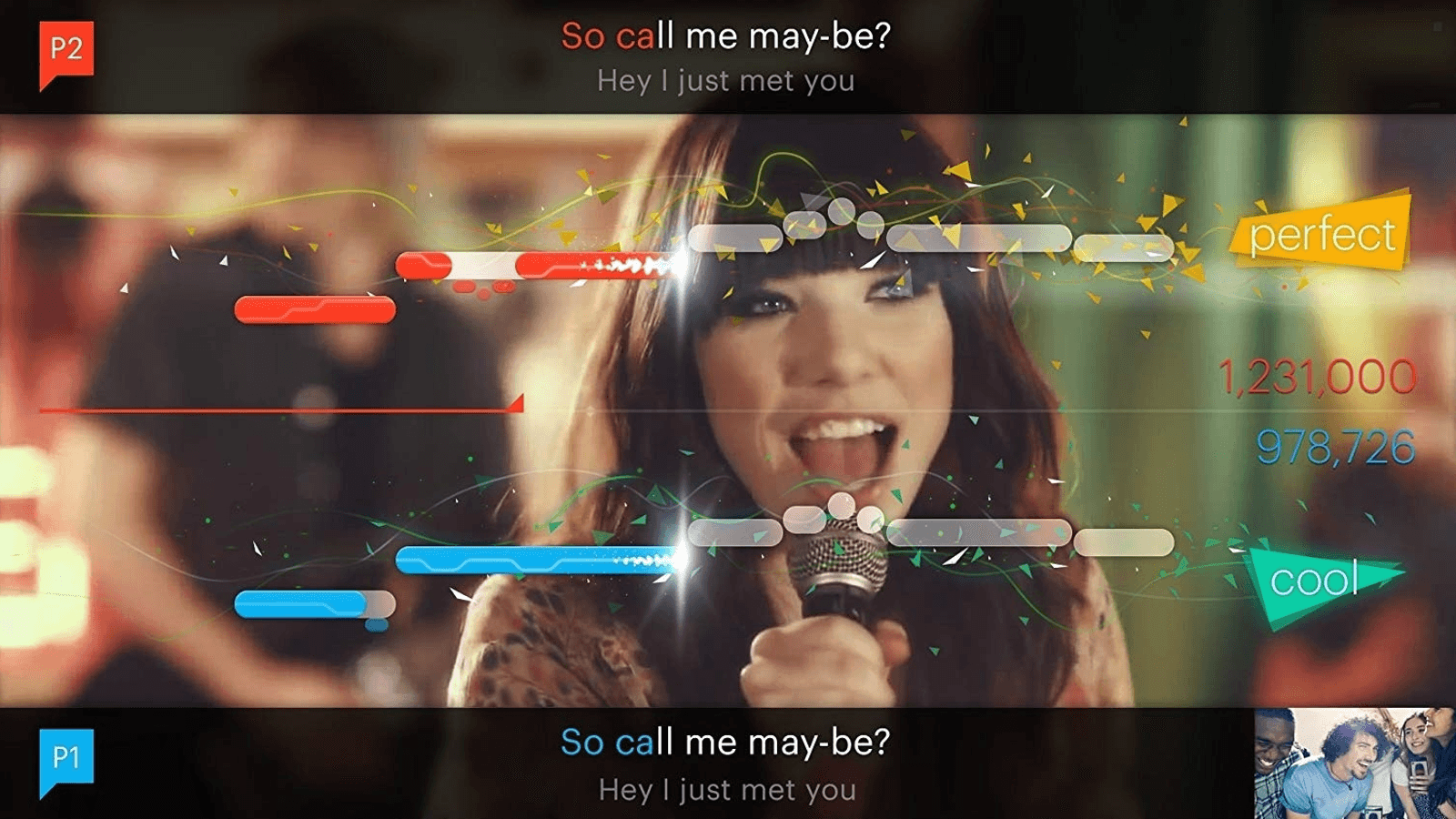
SingHeads was an augmented reality singing app aimed at kids, combining face-tracked 3D avatars with an interactive karaoke experience. Users could sing along with lyrics and real-time pitch tracking, while earning points, and saving or sharing videos on a built-in social media feed.


My Role
Role
UI/UX Designer
UI/UX
Prototyping
Visual Design
Partial Implementation
Micro-Interaction
Team Management
At DRI, I joined the Singheads team early on, helping shape the product vision and translating it into tangible user experiences. Over ten months, I led the design of 80% of the core features, working in a fast-paced environment with evolving priorities and technical constraints.
I facilitated workshops to align stakeholders, built rapid prototypes, and continuously tested with users to validate our direction. Although the product ultimately pivoted due to technical limitations, my time on Singheads was a deep dive into end-to-end product design, creative problem-solving, and shipping under pressure.


My Process

Problem Discovery
Research

Competitive Analisys
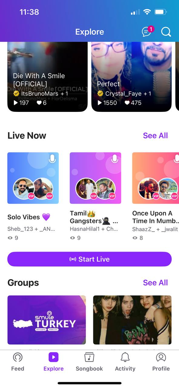
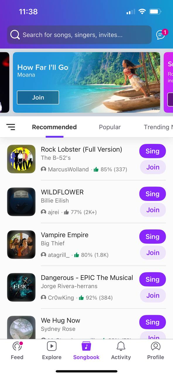
Our direct competitor was an app called Smule, a social media singing platform with a large song library, strong community and features like duets and group songs. But their target demographic was much older and offered no privacy options.
Other partial competitors were vertical video platforms like TikTok, Youtube Shorts and Instagram reels, all very similar in their approach and design. Given the short deadline, I approached this feature with Jakob’s Law in mind.
Design Audit
Smule had similar features but lacked privacy options, making it appeal to an older audience. Our face-tracking avatars aimed to reach a broader user base.
Vertical video, trending in 2019, aligned perfectly with our need for front-camera face tracking.
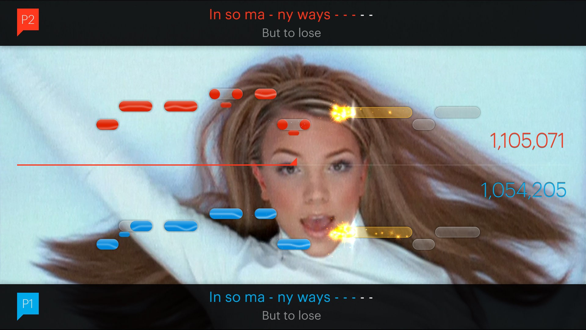
Scoring wasn’t our focus but was key for long-term retention. It had to be simplified compared to Guitar Hero or SingStar, and was inspired partly by Smule’s system.

Understanding our Users
We conducted user interviews with teenagers aged 13 to 18, gathering qualitative insights to better understand them. They we're passionate about singing, but shy about posting online. They loved customisable avatars but disliked subscriptions, preferring ads, which would have made licensing music very difficult. So we focused on appealing to parents instead as something they would subscribe to for their kids.
Stakeholder Workshops
Given the product’s complexity, I needed a clearer view of the stakeholders’ vision. I ran a workshop starting with a co-design session to uncover their goals and expectations, followed by a Crazy Eights exercise to gather design ideas and understand their vision for the look and feel.
With these insights, I was ready to start designing.

Define Phase
Challenges & Goals
Challenge
How might we allows user to record themselves singing while keeping their identity private and allow them share this experience with other people online. Also give them the option to customise online identity in order to better represent their personality.
Challenge
How might we solve the technical challenges that are in the way of us creating an engaging, AR-powered singing experience that’s intuitive, fun, and visually appealing for kids and teenagers, while ensuring monetisation was sustainable and the product was compliant with store policies.
Key Goals
Create an Immersive Singing Experience
Give users the space to post anonymously their best singing moments to an online community that can view and react to their performances.
Make Customization simple but Engaging
Allow users to create customisable avatars that can mimic their facial expressions and react in real time as they sing. This feature should be on both mobile platforms.
Ensure a Frictionless Monetization Flow
Find the right approach to monetising our product in order to meet the business’ and partner’s requirements, attract and retain our target demographic and make it a smooth experience for the user.
Product Strategy
Start with the difficult
Prove the face-tracking avatar could work. The prototype showed issues with expression syncing and lag.
Tackle the music: storage, display, and syncing lyrics and notes in real time.
Avatar customisation, my main task, ensuring it was fun, clear, and well-organised.
Video features came last, aiming to match vertical platforms. The main challenge was backend: storage, autoplay, and smart sorting.
Stick to the MVP
Beyond core features, we also handled accounts, monetisation, GDPR, and expected quality-of-life elements.
We built an MVP using an agile, layered approach, removing features still left us with a usable product. But investor expectations limited how much we could cut.
After, we split into smaller, shifting teams focused on key features, though technical challenges often impacted progress.
Managing Stakeholders
How to Align on the Same Goals
Get to know the team
It’s worth getting to know the people and their specialities, finding the best way to use our strengths to the maximum and complement each other
Focus on the meaningful
With so many features packed into one product, it was important we prioritised and aligned on what the focus should be
Don’t chase perfection
When building something so technically challenging, it mattered more to have a functional concept instead of making it perfect.
Develop Phase
Defining the Product
Flowchart
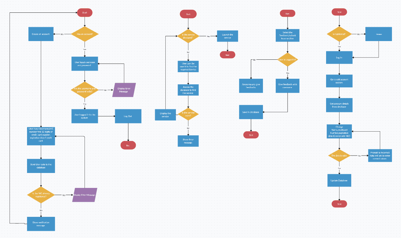
Early flowchart which is quite different than the final version
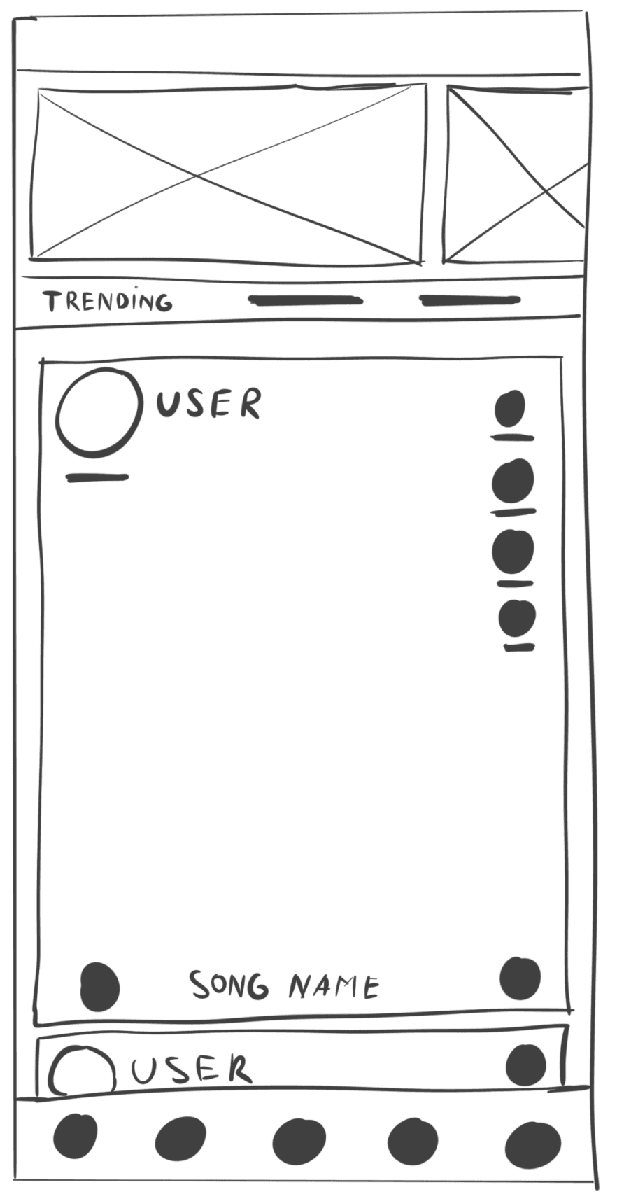
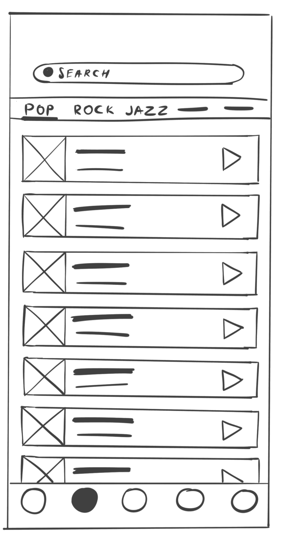
Wireframes


Some higher fidelity wireframes for early prototypes
Prototyping and testing


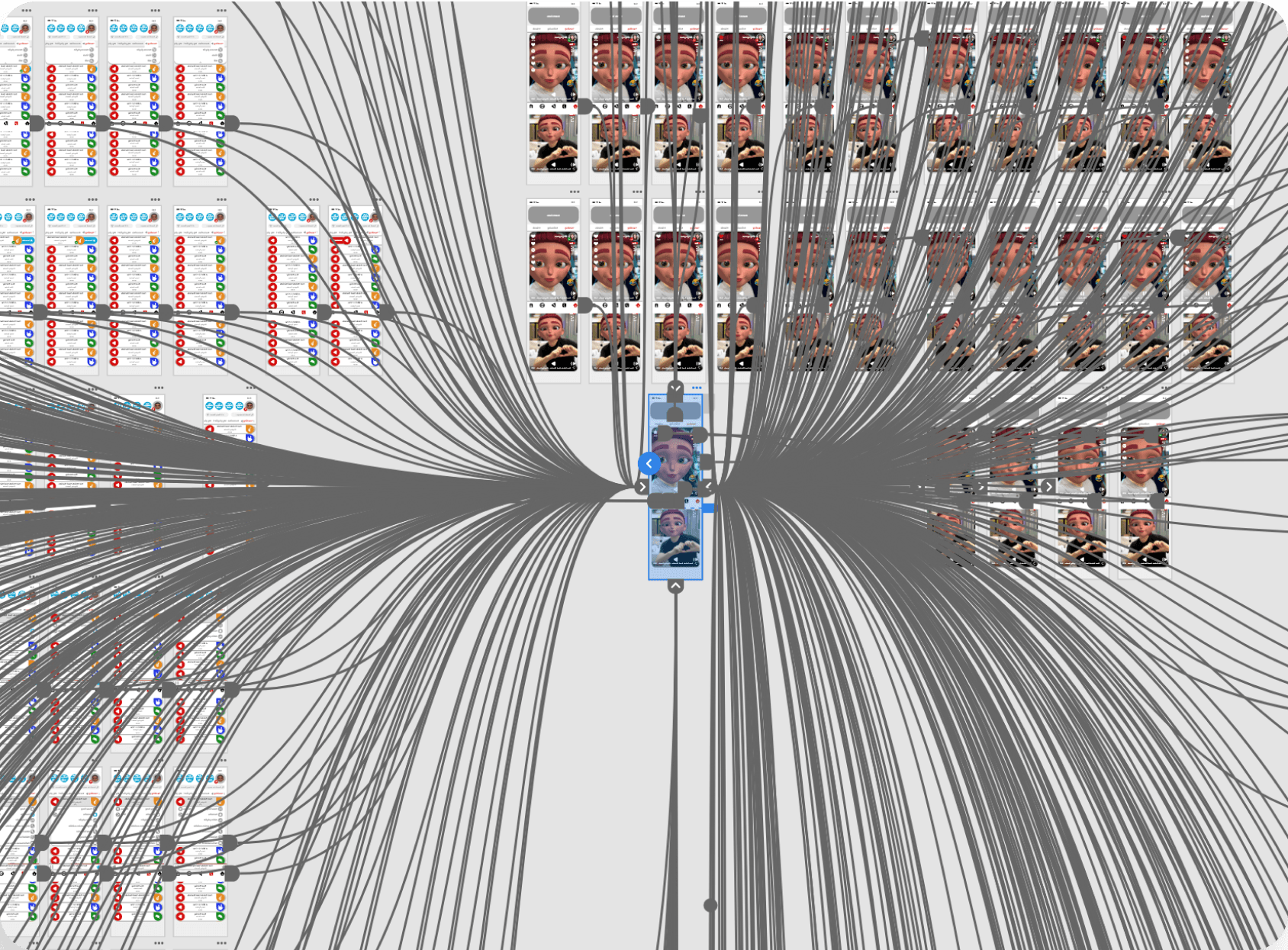
Very complex prototype done in Adobe XD in 2019
Iterations
Before and After
Home Feed
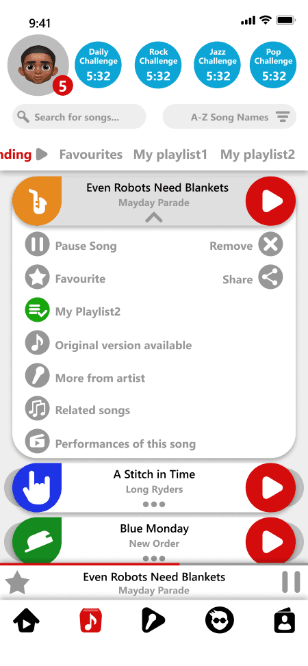
Song Library
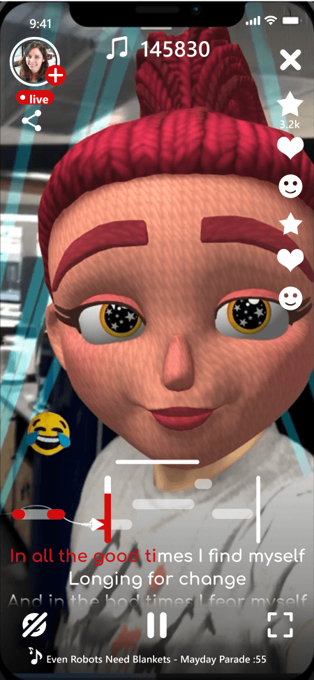
Customisation Page


Delivery Phase
The 3 in one App
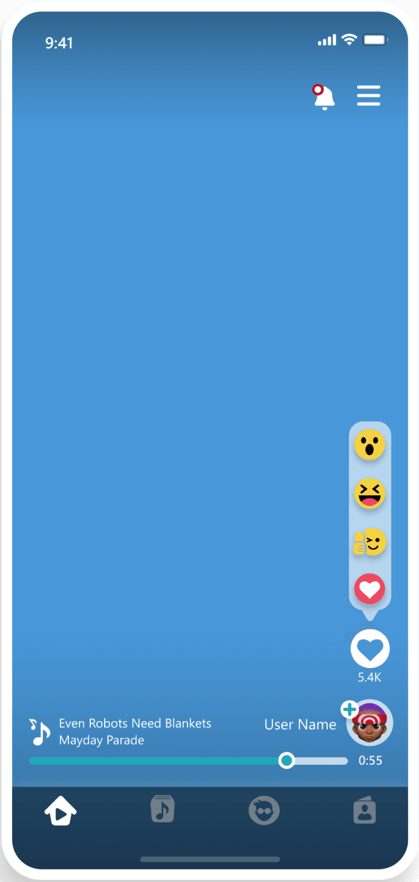
Lobby Screen
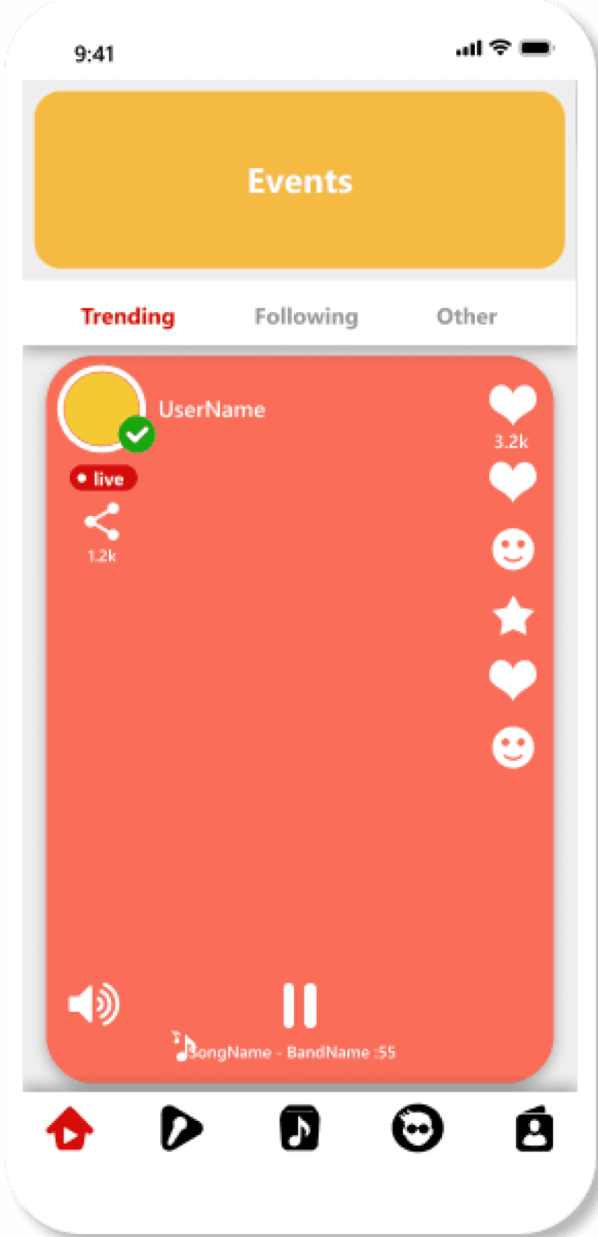
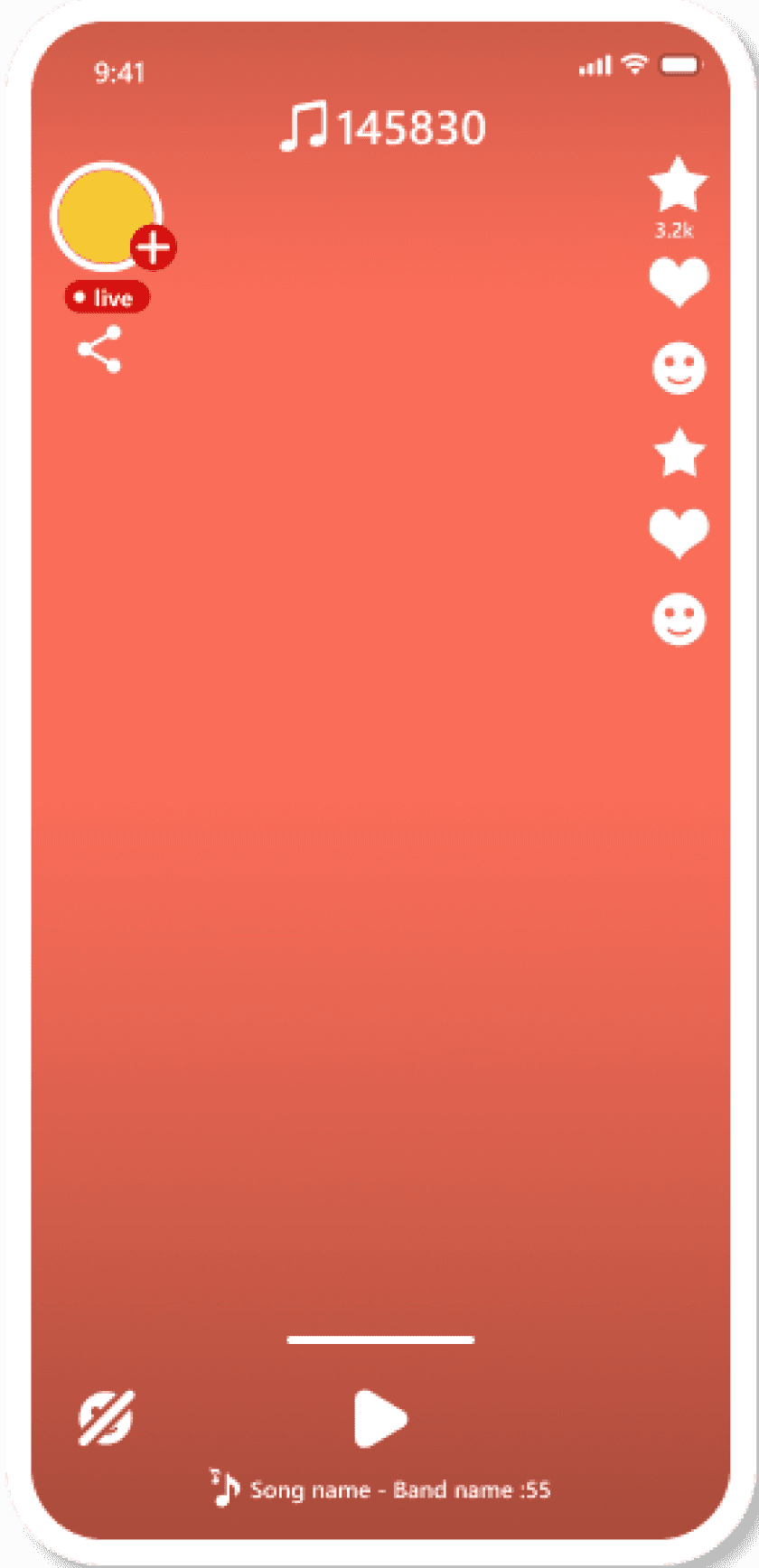
Home feed of video performances
Notifications pop-up with users reactions

The above screens represented the home page, an endless vertical video feed with other peoples performances. You had some controls over the video, you could follow the user or react to his performance with an Emoji. No chat was implemented as we wanted to avoid any swearing for our users. We also removed the search and categories from the MVP, hoping to add this later.
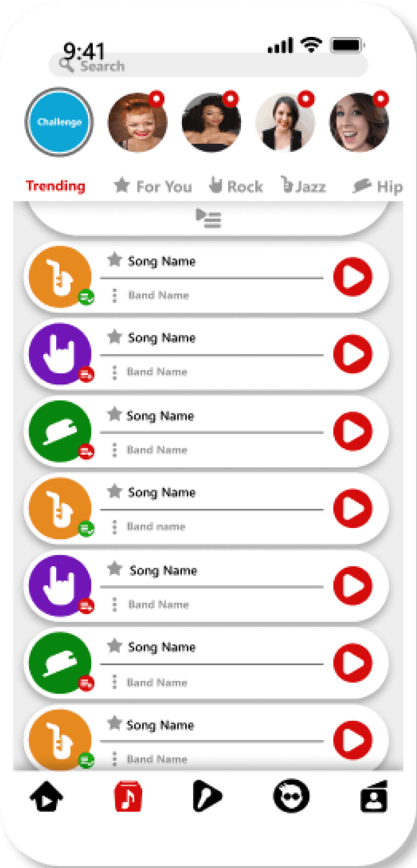
Leaderboard Screen
Home feed of video performances
Notifications pop-up with users reactions

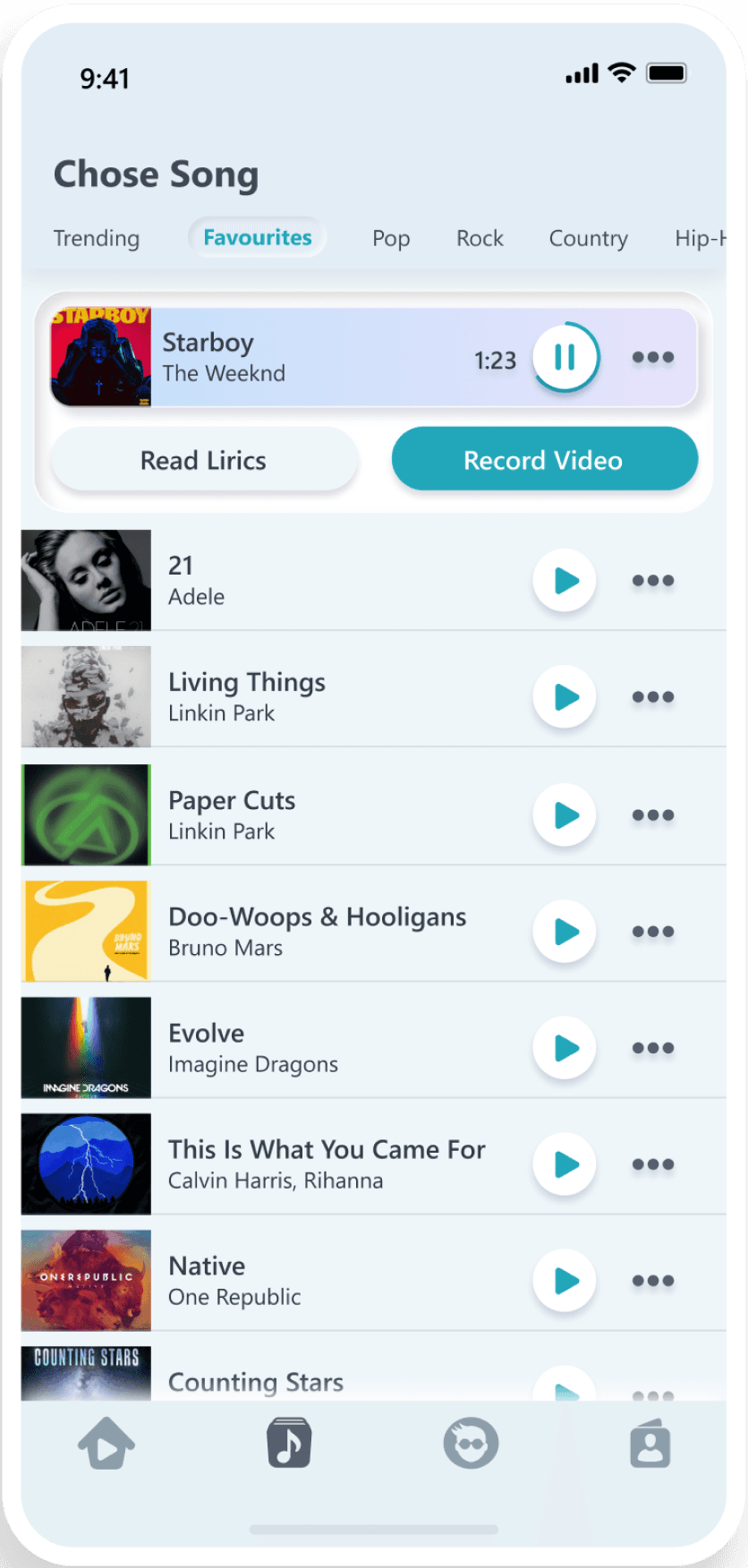
The song library went through a lot of iterations as it is also the point through which you can start a recording. We decided not to have a dedicated record button, and just show users how to start a recording. You can listen to songs and read the lyrics. There were also other ideas for seeing other performances of that song, a shorter version, but they were not for the MVP. Upon selecting a song, you move to the screen on the right which presents your avatar, the song and lyrics and a big button to start the performance.
Settings Screen
Home feed of video performances
Notifications pop-up with users reactions

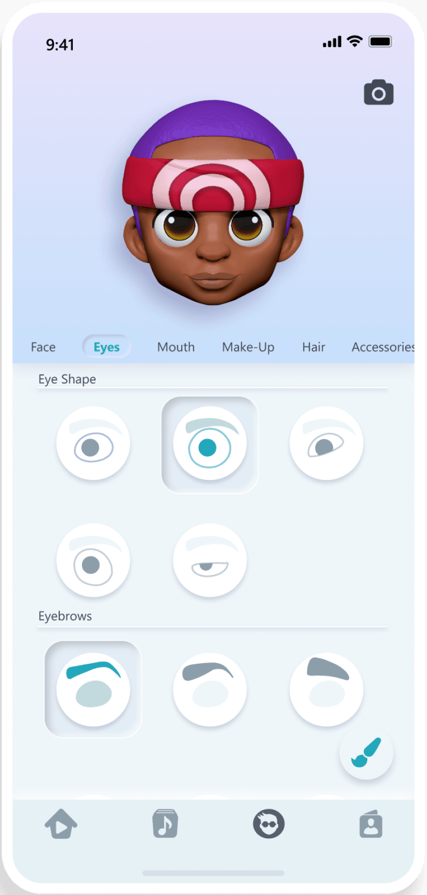
Customisation screen was initially very complex, with endless categories and option for customisation. In the end we had to simplify. Even so, I had to create custom icons for all customisation choices. When organising them, I went with something very close to what Apple did for its Memoji feature, and in user tests, it was the simplest to navigate.
Gameplay Screen
Home feed of video performances
Notifications pop-up with users reactions

The was meant to be highly competitive, showing in real time your score compared to other users, but we had to reduce the scope and focus on simply being able to record the singer’s pitch and assess how close it was to the original singer. We kept the score because it was a feature we’d already developed. On the right, in the account section, I tried to keep it simple, with the Instagram account section as a reference.
Technical Challenges
The technical issues
Despite solid planning and feature prioritisation, technical issues slowed development.
Face tracking worked well on newer iPhones but struggled on Android and often lagged behind facial movements.
Scoring was unreliable due to poor mic input, making pitch detection feel random and inaccurate.
Not that easy to monetise
Early user tests showed strong resistance to subscriptions.
We explored alternatives, but licensing required a reliable revenue stream.
The best compromise: use music covers in order to keep subscription costs down.
Pros: more affordable.
Cons: no original vocals, delayed song availability.
We moved forward with this model, unsure if parents would find it worth paying for.
Outcome and Results
What did we
achieve?
We got all the features in
While not a very polished product, we did manage to hit every milestone and add all the features present in the MVP. Faced with so many complex technical features all in one app, I think what we managed to achieve in just ten months was impressive.
UX validation
In every test and workshop we did, the UX was always mentioned as being the most fully featured and intuitive part of the experience. While I took some personal pride in that, the fact remains that the USP of our product was the facial tracking and the singing which were not quite at the quality we wanted.
Some takeaways
Working with new tech requires flexibility,strict deadlines don’t work.
Early user testing helped catch UX issues fast and let me focus on key features.
Biggest lesson: don’t overpromise. Unrealistic goals set before I joined led to missed deadlines, lost funding, and the product never launching. With a more realistic MVP, Singheads might’ve made it.